YASU CARE
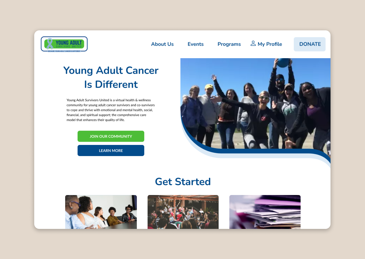
Young Adult Survivors United (YASU) is a non-profit organization that provides emotional, social, financial, and spiritual support to young adult cancer survivors and their caregivers.
We launched YASU Care to level the care that members received, and to make processes more seamless for members and staff. I led design efforts, including a new design system for member-facing digital tools and a re-designed site with better information hierarchy. I conducted user research to determine which parts of the workflow could be automated, and collaborated with Engineering to ensure high quality implementation.
This project was made possible through the efforts of:
︎︎︎ myself (product design lead)
︎︎︎ Diva Agarwal (client relations)
︎︎︎ Elizabeth Chu (UX lead)
︎︎︎ Harkiran Saluja (lead researcher)
︎︎︎ Joshua Suber (tech lead)

PROBLEM
As YASU grew in membership, so did the challenge of scaling their operations.
Their small team struggled to manage the influx of new users that signed up for their various services, which were also expanding.
We needed to streamline their workflows, identify what was resonating with users, and see whether users were aware of YASU’s resources and events.

DISCOVERY
We identified financial grants as the service area that took up most of the workload for Operations, so we created a Google Sheets prototype to process grants.
This was a quick MVP to gauge what the team was comfortable automating, what information they needed from users, and test how their users responded to new systems.
After spending time observing the organization and its operations, we saw that the financial grant process lived within a system of services that operated in a similar way.
Our goal became to find the best opportunity to enable YASU to grow and help as many people as possible.
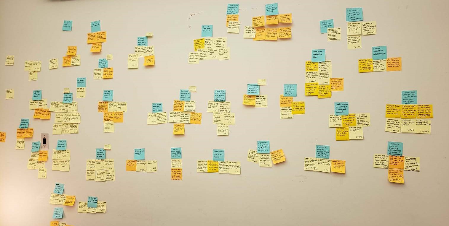
We synthesized all of our notes from observation, user interviews, and surveys, and linked together common threads to summarize key findings.
We found what made YASU successful was their ability to have personal, meaningful interactions with users and to be able to anticipate what they needed. This was especially important for something as emotional and sensitive as a cancer journey.
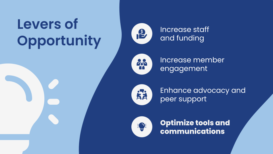
We considered YASU’s future goals and created a roadmap for different facets of YASU across our forecasted stages of growth. We partnered with Operations and interviewed existing users to establish our focus on automating the services that YASU staff was manually providing.
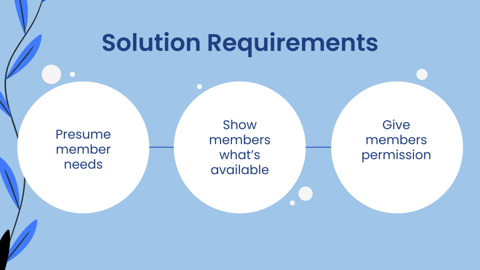
Having done extensive research about what cancer patients and caregivers needed depending on where they were in their cancer journey, we knew the most important thing was to capture the essence of YASU in our solution. We defined these requirements for our final deliverable and presented our research and design direction to stakeholders.
FIRST PROTOTYPE AND USER TESTING
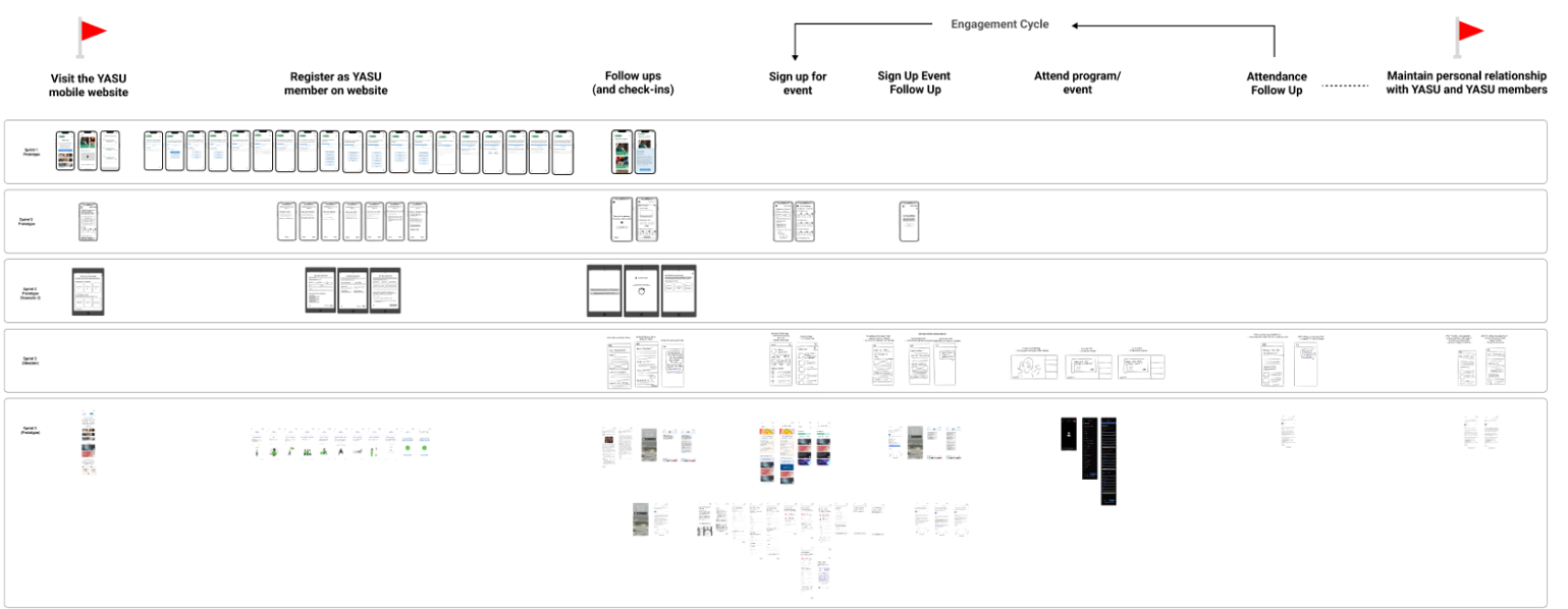
We planned prototypes and testing in sprints, and mapped out each part of the flow that our sprints addressed; the first prototype focused on the first step of the onboarding process, gathering more information during registration to have a better understanding of each user's needs.
We tested using think aloud protocol with end users and staff members to get initial reactions and see how comfortable users were with a longer registration flow.

ITERATE, TEST, REPEAT
We tested out some new concepts and used what we learned to then form new hypotheses for the next sprint.
One blocker we ran into was that we were overeager to give our clients a visual sense of our work; initial reactions of our early prototype focused less on overall experience and more on how things looked. The next iterations building out the rest of the engagement flow were lower in fidelity, and we only built out a high-fidelity prototype when core systems had already been tested.
YASU CARE: A NEW SUPPORT SYSTEM
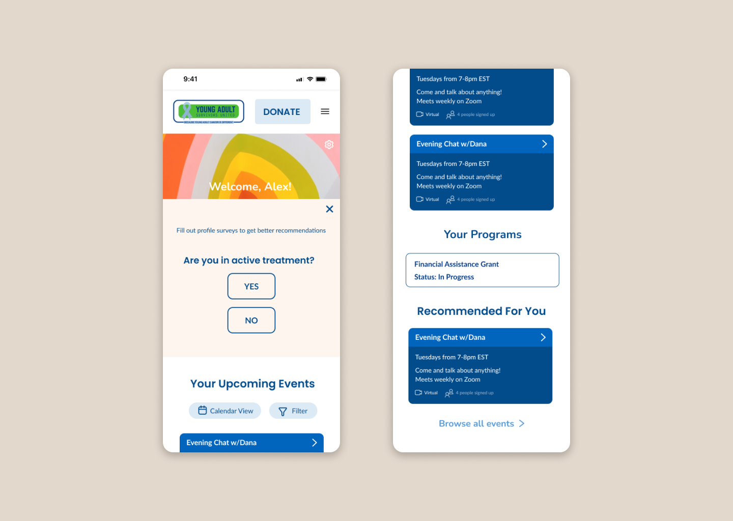
I defined and created new features of the redesigned site and onboarding flow: user profiles to see status updates on registered events and financial grants, and automated and personalized recommendations for relevant services.
I was responsible for determining the site's information hierarchy, as well as visualizing the easiest way for members to access pertinent information about events and programs.
PREPARING FOR SUCCESS
I was responsible for the designs of the final mockups and prototype flow, and I created a design system while bringing the prototype to a high fidelity. This system served as components in collaborating on the final prototype and is meant to be built upon, setting the standard for future implementation and production.
I organized the Figma files to be ready for hand-off and documentation, which was especially important for a complex solution with multiple moving parts—from a model of the user flow, functional mobile and desktop prototype, to documentation of features and requirements.

IMPACT AND FINAL THOUGHTS
~extra 2 hrs/day for staff to focus on other tasks, rather than on manually processes
+25% user retention (users attending at least one event post-signup)
This project had incredible impact on kickstarting the growth of the organization, providing new workflow systems for the staff and a better user experience for their members. YASU had great feedback, citing a shift in organizational strategy with the clear starting point that we had given them.
I found it rewarding to not only design for the complex system of services and touchpoints that was currently in place, but to also create something that could continually grow with more staff, more services, and more members. YASU Care is a service framework that allows budding non-profit YASU to scale by digitizing personalized support for members, while retaining one-on-one time with staff at certain parts of the member journey. It reimagines how members experience the services that YASU provides.
Looking back, I would have expanded on automated recommendations and brought it closer to implementation (which we weren't able to do due to timeframe and technological constraints). The greatest aha! moment of this project for me was during problem exploration. I learned just how important it is to make sure that we're designing the right thing, with purpose; in this case, we learned that one-on-one time with staff made YASU successful, and I designed around replicating that experience to ensure the organization's success as they change and grow.